It is more crucial than ever to stand out from the competition and be taken seriously in the cutthroat business environment of today. Running a grocery store means you want your produce to stand out from the sea of goods and draw customers in. Visual marketing can help with this.
Visual marketing is a type of advertising that places a strong emphasis on the use of images to convey ideas. The use of colour, lighting, displays, arrangement, or other visual elements can achieve this.
You can grab people’s attention and deliver your message in a memorable and eye-catching way using visual marketing. Since the brain processes images much more quickly than words, using visuals to market. Your brand or product can be very effective. Here are some suggestions for assisting with the looks of your produce department:
Create Attractive, Stocked Displays
Patrol your department constantly to keep the produce from looking untouched. Encourage all employees to replenish and restore displays as items are taken out, especially following busy shopping times. When store employees tend to the produce, customers notice and receive another subliminal signal of freshness.
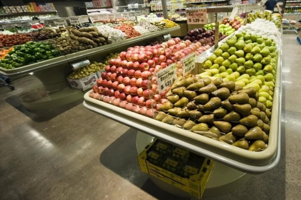
Tiered risers and waterfall displays, which raise produce closer to eye level. They are excellent ways to create fruit and vegetable display the same sense of ‘wow’. A tiered riser can give the impression of large, abundant displays with relatively small amounts of product by giving the feeling of a “wall” of product. If your displays are looking dated and worn, consider buying new fruit and veg produce display tables today to help give your department a fresh new look.
Provide Ideas Through Displays
Consumers who want to eat more produce need suggestions on how to prepare fresh fruit and vegetable display ideas that they may not be familiar with. Produce displays in supermarkets can serve as instructional tools. Create focused “collections” as opposed to simply putting similar produce types together such as all the squash and all the tomatoes.
Combine produce categories to encourage customers to consider trying new recipes or preparations, just as a fashion retailer would do to encourage more sales. Carrots, tomatoes, red peppers, and avocado could be included in a salad “collection” that is presented in an eye-catching way, like an enormous “salad bowl” perched atop a round table and topped with a shelf of salad dressings and bags of freshly baked croutons from your bakery section. Simple “tropical” themes involving pineapples, coconuts, mangoes, papayas, and bananas are a good starting point for stories.
Curating merchandise from various departments is an easy, appealing way to inform and motivate customers. Sell pasta, extra-virgin olive oil, fresh basil, and vine-ripened tomatoes. Use “recipe of the week” cards that customers can take with them to continue the theme. Feature displays can generate visual interest even inside a refrigerator.
Visit: 8 Saving Money Ways: Shopping On Fresh Produce (Grocery Budget 2023)
Create Eye-Catching Designs By Using Colour
There are three essential ways to employ colour effectively. The first is called monochromatic colour harmonies, which happen when you combine objects with the same hue. A pleasing and alluring visual effect can produce by grouping objects that share the same primary colour. For a monochromatic red colour scheme, for instance, you could combine displays of radishes, tomatoes, and red bell peppers.
Colours that are close relatives on the colour wheel, like red, orange, and yellow, make up analogous harmonies. Display tomatoes, radishes, orange bell peppers, yellow bell peppers, and red bell peppers in that order. It create an analogous colour harmony. A lovely “ombre” effect can transform your produce department into an attractive Instagram post.
When two colours that are opposites or nearly opposites on the colour wheel are combined, complementary colour harmonies are produced. Because opposite colours optically intensify one another, this kind of harmony creates a vibrant energy. Try placing displays of blueberries next to kumquats that are bright orange, strawberries next to limes, and yellow bell peppers next to purple eggplant.
Make Eye-Catching Colour Combinations
You can change the impact of your “composition” by varying the proportions of each color—you are not require to use half-and-half. Despite the fact that squares and rectangles are the typical geometric pattern found in stores, mix things up with colourful spirals. Yellow peaches and plums arranged in concentric circles are a common sight in summer fruit and vegetable displays. (Don’t make items seem too pricey to handle; sell fruit “outside” of the design as well.)
Produce colours will appear more intense when viewed in black lighting. Make sure to wipe them down frequently to avoid any dust accumulating.

